Our Work

St. Timothy’s
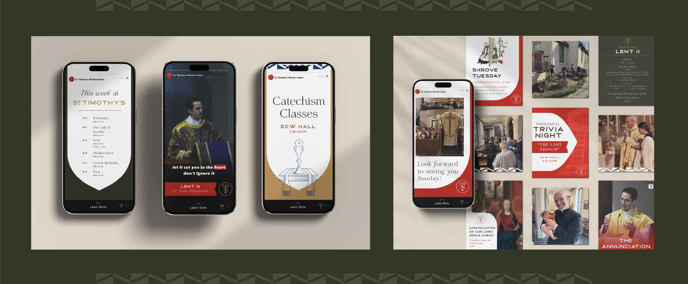
St. Timothy’s approached Common Giant with a need for a more cohesive brand and a robust system of brand assets that reflected their devotion to the mystery of faith and the search for meaning.
All assets needed to be easy to use with clear guides for use to maintain deep brand consistency. St. Timothy’s is rooted in ritual and tradition, the brand needed to follow suit.
We began by conducting qualitative interviews with three generations of parish members to gather insight on St. Timothy’s distinctive approach to faith.
Secondly, we conducted a historical review both of the Episcopal Church and more specifically, St. Timothy of Ephesus, the church’s namesake.
Lastly, we did an audit on all of the church’s current physical and digital media to understand how it was used and imagine new ways to express the brand through media such as prayer cards and promotional items. This audit included visiting the church site for inspiration and understanding of key iconography.
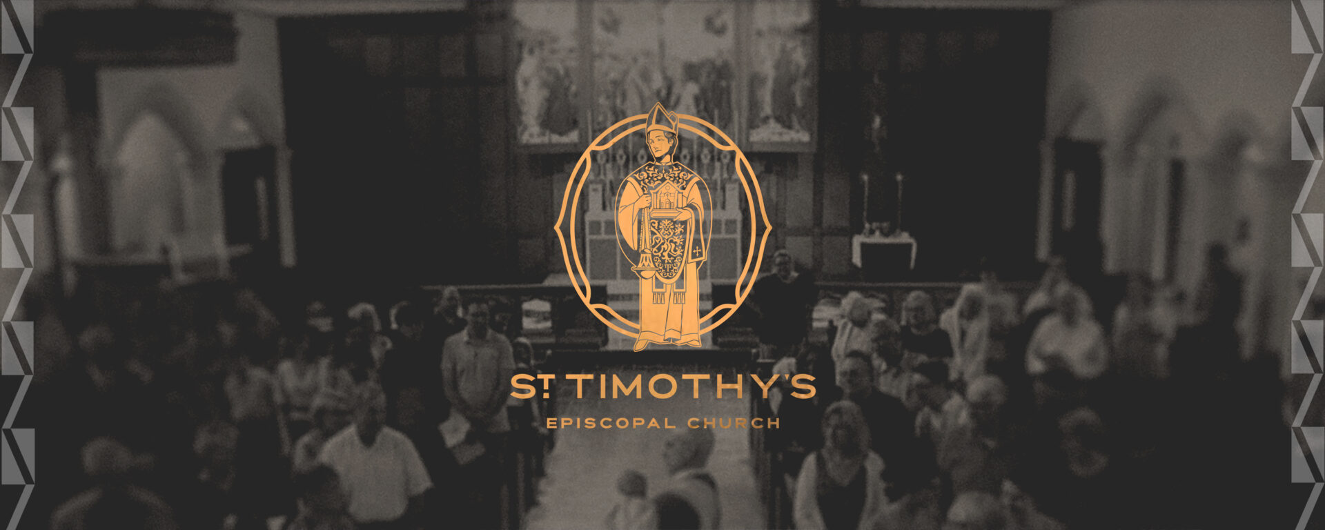
The final brand is one we’re most proud of. Not only does it showcase the devotion and depth of spiritual meaning necessary for a church, it reconciles a long history of tradition with an eye toward future generations of worshippers. The visual identity draws deeply from the church's traditions and sacred space and incorporates key symbols and elements that reflect its spiritual heritage. The icon of St. Timothy was inspired by a carved figure in the sanctuary. The icon’s vestments were inspired by those worn by St.Timothy’s rectors. The lion found on his robe draws inspiration from the resurrection lion carved on the baptismal font upon entering the space. The chevron patterns, chapel windows, and ornate elements were all imagery already living within the space, and brought into the visual communication and identity of the church.


